Problem 2
Design a group table layout with complex predicate development.
Problem 3
Design a combination table layout with simple predicate development.
Problem 4
There is data on the graduation of university students (Table 4.9).
Table 4.9
Based on the table data, construct structural bar and structural sector diagrams.
Problem 5
Based on the data in Table 4.10, construct a histogram, a polygon of cumulative frequencies, and a cumulate.
Table 4.10
Chapter 5_______________________________________________
ABSOLUTE, RELATIVE
AND AVERAGE VALUES
Main questions:
5.1. Absolute values
5.2. Relative values
5.3. Arithmetic and harmonic mean
5.4. Structural averages
5.1. Absolute values
Absolute statistical values– these are indicators that express the volume, size, levels of various socio-economic phenomena and processes in units of weight, area, volume, strength, cost, etc. These are named numbers that always have a specific dimension and units of measurement. The following types of units of measurement are distinguished:
natural– such units that reflect the size of objects and things in physical measures (weight, volume, area, etc.);
cost (monetary)– used to characterize many economic indicators in value terms;
labor– used to determine labor costs (man-hour, man-day);
conditionally natural– units that are used to bring together several types of use values (29.3 MJ/kg).
Absolute values are also divided into individual And are common.
Individual– reflect the size of quantitative characteristics of individual units of the population being studied. Are common– express the size and magnitude of quantitative characteristics of the entire population being studied as a whole.
Absolute values reflect the availability of certain resources; this is the basis of material accounting. They most objectively reflect economic development.
Absolute values are the basis for calculating various relative statistical indicators.
5.2. Relative values
Relative statistics characterize quantitative relationships between phenomena of social life and represent the quotient of dividing one absolute value by another.
When calculating relative values, the denominator always contains the indicator with which the comparison is made (base, comparison base), and the numerator always contains the indicator that is compared (reported, current).
The relative value shows how many times the compared value is greater or less than the base value or what proportion the first is in relation to the second.
Relative values are divided into named And unnamed.
Named relative quantities are the result of a comparison of opposite quantities (kg/piece, t/m, etc.)
Unnamed relative quantities are obtained as a result of comparison of absolute values of the same name. They can be expressed as coefficients, percentages (1/100th of a number), ppm (1/1000th of a number), prodecimal (1/10000th of a number).
The following types of relative statistical quantities are distinguished:
Relative dynamics necessary to characterize changes in a phenomenon over time. They are calculated as growth rates and other dynamics indicators. If a sequential comparison of the indicators of the reporting period is made with the same indicator of the base period, then the base growth rates are calculated. Basic relative values of dynamics show changes in the volume of a phenomenon or the values of its characteristic over a long period of time. If the absolute indicators of the phenomenon under study for the current period are compared with the indicators of the previous period of time, then we obtain chain relative values of the dynamics. They characterize the rate of development of a phenomenon for each given period in comparison with the previous period of time.
Relative magnitudes of structure characterizes the composition of the population being studied. To calculate, it is necessary to know the absolute indicators of individual parts and the entire aggregate as a whole. The ratio of the number of units of a certain group (part of the population) to the total volume of the population is called the relative value of the share (calculated in coefficients). If the share of a characteristic or volume of a population is expressed as a percentage, then the specific gravity indicator is calculated.
Relative comparison value represents the ratio of quantities of the same name related to various objects of statistical observation. (For example, comparing the population of different localities).
Relative coordination values characterize With the relationship of individual parts of the totality to each other. (For example, the ratio of men and women of one enterprise). In this case, one of the parts is taken as the basis for comparison.
Relative intensity values characterizes the breadth of distribution of a phenomenon in a certain environment, i.e. How many units of one population are there per unit of another population? This is always a ratio of opposite quantities.
Modern science cannot be imagined without the use of graphs. They have become a means of scientific generalization.
Statistical graph_ This is a drawing in which statistical aggregates, characterized by certain indicators, are described using conventional geometric images or signs. This, however, does not mean that the graphs are only illustrative. They provide new knowledge about the subject of research, being a method of summarizing the original information.
When constructing a graphic image, a number of requirements must be observed. First of all, the graph must be quite visual, since the whole point of a graphical representation as a method of analysis is to clearly depict statistical indicators. In addition, the schedule must be expressive, intelligible and understandable. To fulfill the above requirements, each schedule must include a number of basic elements: graphic image; graph field; spatial references; scale guidelines; explication of the schedule.
Let's take a closer look at each of these elements.
Graphic image(the basis of the graph) _ these are geometric signs, i.e. a set of points, lines, figures with the help of which statistical indicators are depicted. It is important to choose the right graphic image, which should correspond to the purpose of the graph and contribute to the greatest expressiveness of the depicted statistical data.
Graphic field _ this is the part of the plane where graphic images are located. The graph field has certain dimensions, which depend on its purpose.
Spatial landmarks graphics are specified in the form of a system of coordinate grids. A coordinate system is necessary to place geometric signs in the graph field. The most common is the rectangular coordinate system.
Scale guidelines statistical graphics are determined by the scale and system of scales. The scale of a statistical graph is a measure of the conversion of a numerical value into a graphic one.
The last element of the graph is an explication. Each graph must have a verbal description of its contents. It includes the name of the graph, which briefly conveys its content; captions along the scale bars and explanations for individual parts of the graph.
There are many types of graphic images (Figures 5.2 and 5.3).
Rice. 5.2. Classification of statistical graphs according to the shape of the graphic image
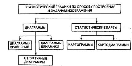
Rice. 5.3. Classification of statistical graphs according to the method of construction and image tasks
Their classification is based on a number of characteristics: a) the method of constructing a graphic image; b) geometric signs depicting statistical indicators; c) problems solved using graphic images.
Based on the method of construction, statistical graphs are divided into diagrams and statistical maps.
Diagrams
Diagrams are the most common method of graphic representations. These are graphs of quantitative relationships. Diagram _ is a graphical representation of the relationships between different quantities using linear segments or geometric figures. The types and methods of their construction are varied. Diagrams are used for visual comparison in various aspects (spatial, temporal, etc.) of quantities independent from each other: territory, population, etc. In this case, the comparison of the studied populations is made according to some significant varying characteristic.
Depending on the range of tasks being solved, comparison diagrams, structural diagrams and dynamics diagrams are distinguished.
COMPARISON DIAGRAMS
The most common comparison charts are bar charts, the construction principle of which is to depict statistical indicators in the form of vertical rectangles - bars. Each column depicts the value of a separate level of the statistical series under study. All compared indicators are expressed in one unit of measurement.
When constructing bar charts, it is necessary to draw a rectangular coordinate system in which the bars are located. The bases of the columns are located on the horizontal axis; the size of the base is determined arbitrarily, but is set the same for everyone.
The scale that determines the height scale of the columns is located along the vertical axis. The vertical size of each bar corresponds to the size of the statistical indicator shown on the graph. Thus, for all the bars that make up the chart, only one dimension is a variable. Let us show the construction of a bar chart based on the data in the table. 5.5, characterizing citizens’ deposits in Sberbank institutions in 2000 (Fig. 5.4).
Table 5.5
Citizens' deposits in Sberbank institutions in 2000 (conditional figures)

Fig.5.4. Diagram of citizens' deposits in Sberbank institutions
Varieties of bar charts are so-called ribbon or strip charts. Their difference is that the scale is located horizontally at the top or bottom and it determines the size of the stripes along the length. As an example, we present a comparison bar diagram based on the data in Table. 5.6 (Fig. 5.5).
STRUCTURAL DIAGRAMS
The main purpose of structural diagrams is to graphically represent the composition of statistical populations, characterized as the ratio of the various parts of each population. The composition of a statistical population can be graphically represented using both absolute and relative indicators. In the first case, not only the sizes of individual parts, but also the size of the graph as a whole are determined by statistical values and change in accordance with changes in the latter. In the second, the size of the entire graph does not change (since the sum of all parts of any set is 100%), and only the sizes of its individual parts change. A graphical representation of the composition of the population in absolute and relative indicators facilitates a more in-depth analysis and allows for international comparisons and comparisons of socio-economic phenomena.
Table 5.6
Total volume of industrial production in some CIS countries in the first quarter of 2000 (as a percentage of the first quarter of 1999) (conditional figures)
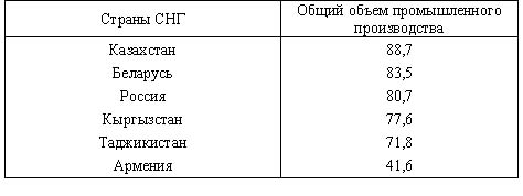

Rice. 5.5. Total volume of industrial production in some CIS countries in the first quarter of 2000 (as a percentage of the first quarter of 1999)
The most common way to graphically depict the structure of statistical populations is a pie chart, which is considered the main form of chart for this purpose. This is explained by the fact that the idea of the whole is very well and clearly expressed by the circle, which represents the entirety. The share of each part of the population in a pie chart is characterized by the value of the central angle (the angle between the radii of the circle). The sum of all angles of a circle, equal to 360°, is equal to 100%, and therefore 1% is taken equal to 3.6°.
An example of constructing a pie chart based on the data in Table. 5.7 is shown in Fig. 5.6.
The use of pie charts allows not only to graphically depict the structure of a population and its changes, but also to show the dynamics of the population of this population. To do this, circles are constructed proportional to the volume of the characteristic being studied, and then its individual parts are highlighted in sectors.
Table 5.7
Dynamics of the share of the non-state sector of the economy in one of the regions of Russia in retail trade (as a percentage of the total volume of retail turnover in the Russian region; figures are conditional)

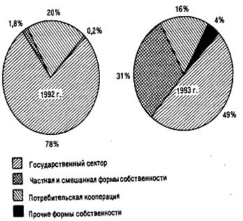
Rice. 5.6. Pie chart according to table. 5.7
DYNAMICS DIAGRAMS
To visually depict phenomena in time series, charts are used: bar, strip, square, circular, linear, radial, etc. The choice of chart type depends mainly on the characteristics of the source data and the purpose of the study. When the number of levels in a dynamics series is large, it is advisable to use linear diagrams that reproduce the continuity of the development process in the form of a continuous broken line. In addition, line diagrams are convenient to use: if the purpose of the study is to depict the general trend and nature of the development of a phenomenon; when it is necessary to display several time series on one graph for the purpose of comparing them; if the most significant is the comparison of growth rates, not levels.
To construct linear graphs, a rectangular coordinate system is used. Typically, the abscissa axis represents time (years, months, etc.), and the ordinate axis represents the size of the depicted phenomena or processes. Scales are marked on the ordinate axes. Special attention you should pay attention to their choice, since the overall appearance of the graph depends on it.
Let's consider constructing a linear diagram based on the data in table. 5.8.
Table 5.8
Dynamics of the gross harvest of grain crops in the region for 1990-1999.
Depicting the dynamics of the gross harvest of grain crops on a coordinate grid with a continuous scale of values starting from zero is hardly advisable, since 2/3 of the fields of the diagram remain unused and do not contribute anything to the expressiveness of the image. Therefore, under these conditions, it is recommended to construct a scale without a vertical zero, i.e., the value scale breaks close to the zero line and only part of the entire possible graph field appears on the diagram. This does not lead to distortions in the depiction of the dynamics of the phenomenon, and the process of its change is depicted more clearly in the diagram (Fig. 5.7).

Rice. 5.7. Dynamics of the gross harvest of grain crops in the region for 1990-1999.
Statistical maps
Statistical maps are a type of graphic images of statistical data on a schematic geographical map, characterizing the level or degree of distribution of a particular phenomenon in a certain territory.
The means of depicting territorial placement are shading, background coloring or geometric shapes. There are cartograms and cartodiagrams.
Cartogram_ This is a schematic geographical map on which, by shading of varying density, dots or coloring of a certain degree of saturation, the comparative intensity of some indicator within each unit of the territorial division mapped is shown (for example, population density by region or republic, distribution of regions by grain yield and etc.). Cartograms are divided into background and point.
Background cartogram _ a type of cartogram in which shading of varying density or coloring of a certain degree of saturation shows the intensity of any indicator within a territorial unit.
Point cartogram _ type of cartogram, where the level of the selected phenomenon is depicted using points. A point represents one unit of a population or a certain number of them, showing on a geographical map the density or frequency of occurrence of a certain characteristic.
Background cartograms, as a rule, are used to depict average or relative indicators, point maps are used for volumetric (quantitative) indicators (population, livestock, etc.).
Let's consider constructing a cartogram using the data in Table. 5.9.
Before you start building a cartogram, you need to divide the areas into groups according to population density, and then assign a specific color or shading to each.
Table 5.9
Population density of eight districts of the region (conditional figures)
According to the data in Table. 5.9, all areas according to population density can be divided into three groups: 1) areas with a population density of up to 4 thousand people; 2) from 4 to 12 thousand people; 3) from 12 to 17 thousand people. Then the first group includes districts No. 1, 8; to the second _ ¹ 2, 3, 7; to the third _ ¹ 4, 5, 6. If we take for each group of districts colors of different saturation, then the background cartogram clearly shows how individual districts are located in the region according to population density (Fig. 5.8).
Rice. 5.8. Population density cartogram for eight districts of the region
The second large group of statistical maps consists of map diagrams, which are a combination of diagrams with a geographic map. Card chart This is a graphical representation on a map using a diagrammatic figure of the total value, structure and dynamics of a statistical indicator within a unit of territorial division. Chart figures (columns, squares, circles, shapes, stripes) are used as pictorial signs in map diagrams, which are placed on the contour of a geographic map. Map diagrams make it possible to geographically reflect more complex statistical and geographical constructions than cartograms.
Among the map diagrams, map diagrams of simple comparison should be highlighted. On a simple comparison chart, in contrast to a regular chart, the diagrammatic figures depicting the values of the indicator under study are not arranged in a row, as on a regular chart, but are spread across the entire map in accordance with the region, region or country that they represent.
Elements of the simplest cartodiagram can be found on a political map, where cities differ in different ways. geometric shapes depending on the number of inhabitants.
As an example of a map diagram, let’s take an image of the gross grain harvest in the Central region of Russia (Fig. 5.9).
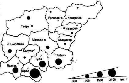
Rice. 5.9. Gross grain harvest of the Central region of Russia
Introduction
Art is one of the most important and interesting phenomena in the life of society, an integral part of human activity, playing a significant role in the development of not only the individual, but also society. The essence of art is determined by the fact that it represents the most complete and effective form of aesthetic awareness of the surrounding world. Of course, art had to take various forms in order to embody all the ideas, thoughts, and feelings of people not in the form of abstract concepts, but in a very concrete form. For this, art has a special, unique means - the artistic image. With the help of artistic images, art conveys ideas in the unity of content and sensual forms. However, the artistic image appears completely different in different types art. Each type of art has its own specifics, poses its own problems and creates its own means and techniques to solve them. All arts have their own language and a certain uniqueness of artistic possibilities. In this work we will try to reflect as accurately as possible the features of creating an artistic image in the art of graphics. Based on various characteristics, art can be divided into different groups and types.
Firstly, graphics belong to the spatial (plastic) arts, that is, a graphic work of art has a specific material carrier and does not need a time component like temporary arts that develop over time (music, artistic expression).
Secondly, graphics belong to the fine arts, that is, they reflect reality in visual, visually perceptible images in which the forms of reality itself are recognized and, thanks to the method of generalization, typification, and the artist’s imagination, it has the opportunity to aesthetically reveal the temporal development of events, spiritual appearance, experiences, thoughts, relationships between people, to embody social ideas (unlike architecture, which does not depict the world around us, but creates its own world, not similar to the reality given to us by nature). In addition to graphics, the fine arts also include painting and sculpture. But these three types of fine arts have, in addition to common features, a huge number of differences.
> Graphics and its types
> The concept of a schedule
Like all fine arts, graphics can be divided into three types:
monumental - closely related to the architectural ensemble, for example, posters (monumental printed graphics), wall graphics, cardboards;
easel - performed “on a machine”, having no connection with a specific interior, the purpose and meaning of the work is completely exhausted by the artistic content (drawing, print, popular print);
decorative - book illustrations, postcards, any graphic images on any object that do not have any special artistic value, but serve to organize the surface of the object. Decorative graphics also include floristry - compositions created using tree fluff, straws and other “living” materials.
If graphics can easily be classified in the same way as other fine arts, then how is it radically different from sculpture and painting? The specificity of graphic art is drawing. Although drawing (as an artistic and expressive means) is used in all types of fine arts, in graphics it is the leading, defining principle and is used in a purer form. Therefore, we can consider drawing the main means of graphics (like plasticity in sculpture, color in painting). The word “graphics” itself originates from the Greek grapho - I write, I draw. The drawing demonstrates the character, temperament, and mood of the artist. The language of graphics is based mainly on the expressive capabilities of a line, stroke, spot (sometimes of color), the background of the base (usually a sheet of paper - white or tinted) with which the image forms a contrast or nuanced relationship. Despite the fact that color in graphics is of great importance, it is still used more limitedly than in painting. Graphics tend to be monochromatic, most often extracting artistic expression from a combination of two colors: white (or another shade of the base) and black (or some other color of the coloring pigment). Graphic materials and techniques are varied, but, as a rule, the basis is a paper sheet. The color and texture of the paper play a big role. Colorful materials and techniques are determined by the type of graphics. Depending on the nature of the technique, easel graphics are divided into two types: printmaking and drawing.
Chapter 5. Graphical representation of statistical data
Integrated use of absolute and relative values
One of the conditions for the correct use of statistical indicators is the study of absolute and relative values in their unity. If this condition is not met, you may come to the wrong conclusion. Only the comprehensive use of absolute and relative values provides a comprehensive description of the phenomenon being studied.
Examples.
1. Total enterprises 200 units = 100% 250 units. = 100%;
incl. state 40 units = 20% 40 units. = 16%;
non-state 160 units = 80% 210 units. = 84%.
2. Unemployment 1 thousand people. ® 2 thousand people = 2 times (+ 1 thousand people);
940 thousand people ® 990 thousand people = 105.3% (+ 50 thousand people).
Self-test questions:
Ø What are absolute and relative values?
Ø In what units of measurement are absolute values expressed?
Ø What types of relative quantities do you know?
Ø What characterizes each type of relative quantities and how are they calculated?
Ø Name the conditions for the correct use of absolute and relative quantities.
Statistical graph – This is a drawing in which statistical aggregates, characterized by certain indicators, are described using conventional geometric images or signs.
A graphical representation allows you to monitor the reliability of statistical indicators, since inaccuracies and inconsistencies are more obvious on the graph. Graphs are also widely used to study the structure of phenomena, their changes over time and location in space. The graph shows the main trends in the development and interrelationships of phenomena more clearly.
When constructing a schedule, a number of requirements must be met. This is primarily the clarity of the graphic image, expressiveness and intelligibility.
Components of the schedule:
Graphic image (graphic basis) – these are geometric signs, that is, a set of points, lines, figures with the help of which statistical indicators are depicted. It is important to choose the right graphic image, which should correspond to the purpose of the graph and contribute to the greatest expressiveness of the depicted statistical data.
Graph field– this is the part of the plane where graphic images are located. The graph field has certain dimensions, which depend on the purpose of the graph.
Spatial landmarks graphics are specified in the form of a system of coordinate grids. A coordinate system is necessary to place geometric signs in the graph field. The most common is the rectangular coordinate system. To construct statistical graphs, usually only the first and occasionally the first and fourth quadrants are used.
Scale guidelines graphics are determined by scale and scale system. Scale is a measure of converting a numerical value into a graphic one. Scale bar called a line whose individual points can be read as specific numbers.
Explication– verbal description of the content of the graph. It includes the title of the graph, labels along the scale bars, and explanations for individual areas of the graph.
The material obtained as a result of statistical research is often depicted using points, geometric lines and figures or graphs.
In statistics, a graph is a visual representation of statistical quantities and their relationships using geometric points, lines, and figures.
Performance data in graphical form allows you to solve a wide variety of problems. The main advantage of such a presentation is clarity. The trend towards change is easily visible on the graphs. You can even determine the rate at which a trend is changing. Various ratios, the interrelation of various processes - all this can be easily seen on the graphs.
Graphs give the presentation of statistical data greater clarity than tables, expressiveness, facilitate their perception and analysis. Statistical schedule allows you to visually assess the nature of the phenomenon being studied, its inherent patterns, and relationships with other indicators. Even in ancient times, the Chinese said that one picture is worth a thousand words. Graphs make statistical material more understandable, accessible and accessible to non-specialists, attract the attention of a wide audience to statistical data, and popularize statistics and statistical information.
At every opportunity analysis For statistical data, it is always recommended to start with their graphical representation. Schedule allows you to immediately get the general performance about the entire set of statistical indicators. The graphical method of analysis acts as a logical continuation of the tabular method and serves the purpose of obtaining general statistical characteristics of processes characteristic of mass phenomena.
With the help of graphical representation of statistical data, many problems of statistical research are solved. :
visual representation of the magnitude of indicators (phenomena) in comparison with each other;
characterization of the structure of any phenomenon;
change of a phenomenon over time;
progress of the plan;
the dependence of changes in one phenomenon on changes in another.
In other words, a wide variety of graphs are used in statistical research. In each graph, the following main elements are distinguished:
spatial reference points (coordinate system);
graphic image;
graph field;
scale guidelines;
explication of the schedule;
name of the schedule
Spatial landmarks are specified in the form of a system of coordinate grids. In statistical graphs, the rectangular coordinate system is most often used. Sometimes the principle of polar (angular) coordinates is used (circular graphs). On the axes of the coordinate system, the characteristics of the statistical characteristics of the depicted phenomena or processes are located in a certain order. Features located on the coordinate axes can be qualitative or quantitative.
Graphic image statistical data is a collection of lines, figures, points that form geometric figures of different shapes ( circle, squares, rectangles, etc.) with different shading, coloring, and density of dots.
Any phenomenon studied by statistics can be represented in graphical form. To do this, you need to find the right graphical solution, determine the graphical image that best matches the given phenomenon and more clearly depicts the statistical data. The graphic image must correspond to the purpose graphic arts. Therefore, before building graphic arts it is necessary to understand the essence of the phenomenon and the goal that is set for the graphic image. Selected form graphic arts must correspond to the internal content and nature of the statistical indicator. For example, a comparison in a graph is made along dimensions such as square, length one of the sides of the figures, the location of the points, their density, etc.
Thus, to depict changes in a phenomenon over time using the most natural type graphic arts is the line. For distribution rows – polygon or bar chart.
Each of the main types of graphic images in statistical practice is constructed taking into account certain rules. In statistical research, to clarify the characteristic features and characteristics of mass phenomena, to understand what is typical in these phenomena and to solve other problems, comparison of some absolute, average and relative statistical values with others is widely used. Analysis– this is, first of all, a comparison and comparison of statistical data. Often there is a need to compare the results of a statistical study of a specific phenomenon with the values of a typical (ideal) phenomenon of a similar nature. Therefore, visual performance(graphical representation) comparison of statistical indicators is one of the most common graphs in statistics. Diagrams are used for these purposes.
A diagram is a graphical representation , clearly showing the relationship between the compared quantities. Diagram is a drawing in which statistical data is conventionally depicted by geometric lines, figures and bodies of various sizes.
There are the following main types of comparison graphs (diagrams):
columnar;
strip;
square;
circular;
curly.
The following computer programs are used to construct diagramsExcel, Mathcad, MATLAB and others.
To build a diagram in the program Excel:
Select the graph, histogram, bar chart, or area chart to which you want to add a data table.
From the Chart menu, select Chart Options, and then click the Data Table tab.
To show or hide chart data in the grid at the bottom of the chart, select or clear the Data Table check box.
In bar charts and charts with a time axis, the data table does not replace the chart axis, but is aligned with the chart.
To attach a table of data to a category axis in a 3-D chart, on the Chart menu, choose 3-D View, and then select the Perpendicular Axes check box.
In charts Excel There is one small minus. If you have built a chart based on data that you plan to add over time, then as you add data to the table on which it is based diagram, you will also have to change range data for the chart to include in display. Or immediately indicate the obviously larger one range, but then diagram looks very ugly.
To create graphs in the Mathcad system there is a software graphic CPU. During its development, the main attention was paid to ensuring ease of setting graphs and their modification using appropriate parameters. CPU allows you to build a variety of graphs, for example, in Cartesian and polar coordinate systems, three-dimensional surfaces, level graphs.
Templates are used to build graphs. Their list contains a submenu Graph menu Insert. Most of the GPU parameters required for plotting are set automatically by default, so for initial plotting graphic arts of one type or another, it is enough to specify the type graphic arts. In submenu Graph contained list of the seven main types of charts. They allow you to do the following:
X – Y Plot (Cartesian graph) – create a template of a two-dimensional graph in a Cartesian coordinate system;
Polar Plot – create a plot template in polar coordinates;
3D Plot Wizard (three-dimensional graph wizard) – call the Wizard to build three-dimensional graphs with specified properties;
Surface Plot - create a template for constructing a three-dimensional plot;
Contour Plot – create a template for a contour plot of a 3D surface;
3D Scatter Plot – create a template for a graph in the form of points (shapes) in three-dimensional space;
3D Bar Plot (three-dimensional bar chart) – create a template for an image in the form of a collection of bars in three-dimensional space;
Vector Field Plot – create a template for a vector field plot on a plane.
Related to the concept of graphics performance about graphic objects that have certain properties. In most cases, you can forget about objects unless you are doing object-oriented programming. Most high-level graphics teams are focused on the end user. They automatically set the properties of graphic objects and ensure graphics are reproduced in the desired coordinate system, color palette, scale, etc.
Graphs in MATLAB are plotted in separate scalable and movable windows. You can rotate the constructed figure with the mouse and observe it from different angles, and such rotation does not require any programming
MATLAB Graphics Tools contains three commands:
New Figure – opens an empty graphics window;
Plot Tools – opens a powerful graphics editor window;
More Plots… - opens a window to access various types of graphics.
One of the advantages of the MATLAB system is the abundance of tools for plotting graphs, starting from plotting commands simple graphs functions of one variable in a Cartesian coordinate system and ending with combined and presentation graphs with animation elements, as well as graphical user interface design tools ( CUI). Particular attention in the system is paid to three-dimensional graphics with functional coloring of the displayed figures and simulation of various lighting effects.
Brief summary
The concept is considered graphic arts and its necessity in statistical calculations, as a visual means of presenting data. In statistics, a graph is a visual representation of statistical quantities and their relationships using geometric points, lines, figures or geographic maps.
Graphics tools in three main programs are considered Excel, Mathcad, MATLAB.
Self-test questions
What is a graph called in statistics?
What problems of statistical research are solved using graphical images?
How are Spatial Landmarks set?
What is a graphical representation of statistical data?
Define Diagram.
List the types of diagrams.
Where is the list of graphing templates in the Mathcad system?
What commands do MATLAB graphics tools contain?