When working in Excel, tabular data is often not enough to visualize information. To increase the information content of your data, we recommend using graphs and charts in Excel. In this article, we will look at an example of how to build a graph in Excel based on table data.
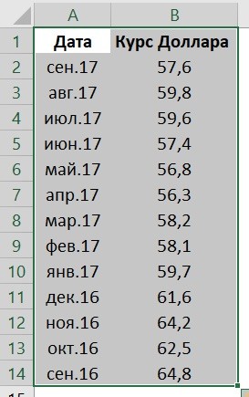
Let's imagine that we have a table with monthly data on the average dollar exchange rate during the year:
Based on this data, we need to draw a graph. For this we need:
- Select table data, including dates and exchange rates with the left mouse button:
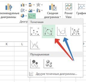
- On the toolbar, go to the “Insert” tab and in the “Charts” section select “Chart”:
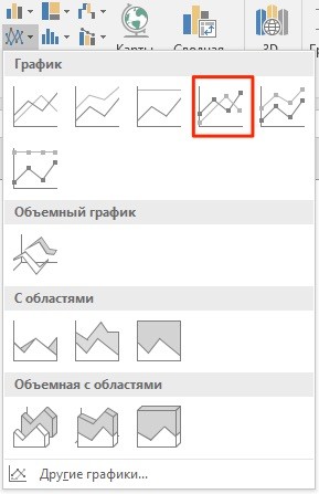
- In the pop-up window, select the appropriate chart style. In our case, we select a graph with markers:
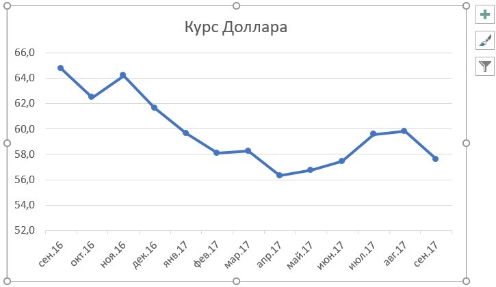
- The system built a graph for us:
How to plot in Excel based on table data with two axes
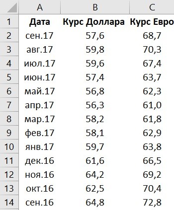
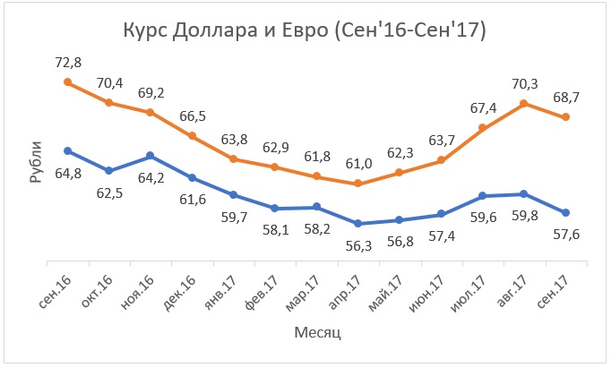
Imagine that we have data not only for the Dollar but also for the Euro, which we want to fit on one chart:
To add Euro exchange rate data to our chart, you need to do the following:
- Select the graph we created in Excel with the left mouse button and go to the “Designer” tab on the toolbar and click “Select Data”:
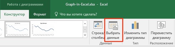
- Change the data range for the generated graph. You can change the values manually or select an area of cells by holding down the left mouse button:

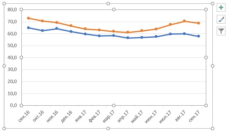
- Ready. The chart for the Euro and Dollar exchange rates is built:
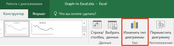
If you want to display graph data in different formats along two axes X and Y, then for this you need:
- Go to the "Designer" section on the toolbar and select "Change Chart Type":
- Go to the “Combined” section and for each axis in the “Chart Type” section select the appropriate type of data display:
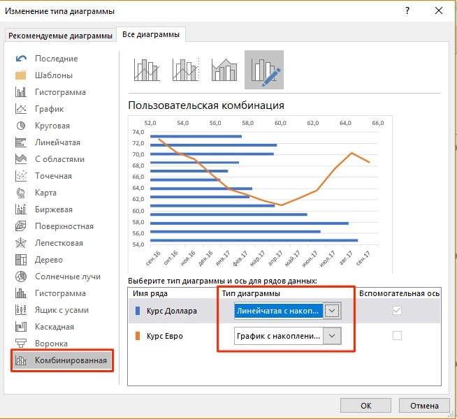
- Press "OK"
Below we will consider how to improve the information content of the obtained graphs.
How to add title to excel chart
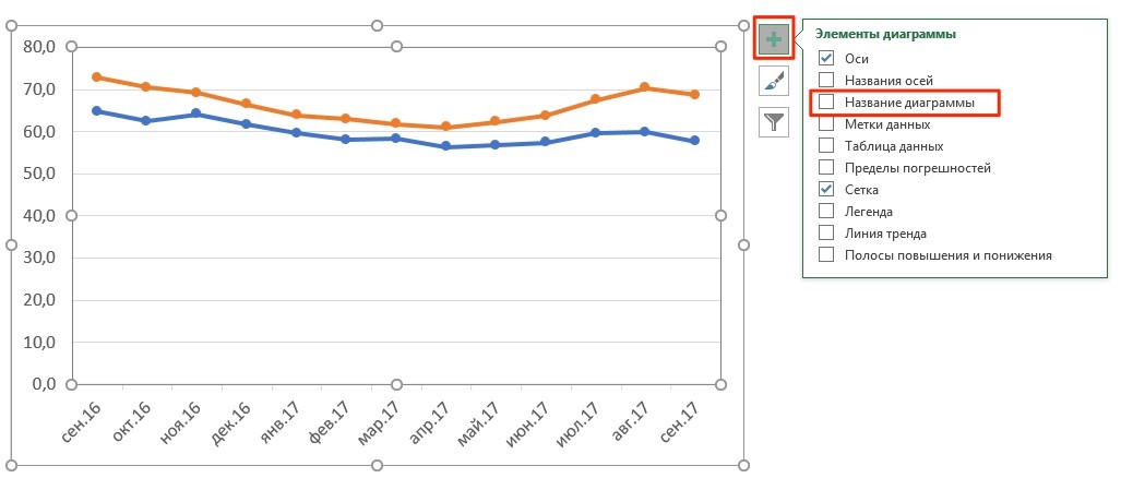
In the examples above, we built graphs of the Dollar and Euro rates, without a heading it is difficult to understand what it is about and what it refers to. To solve this problem we need:
- Click on the chart with the left mouse button;
- Click on the “green cross” in the upper right corner of the chart;
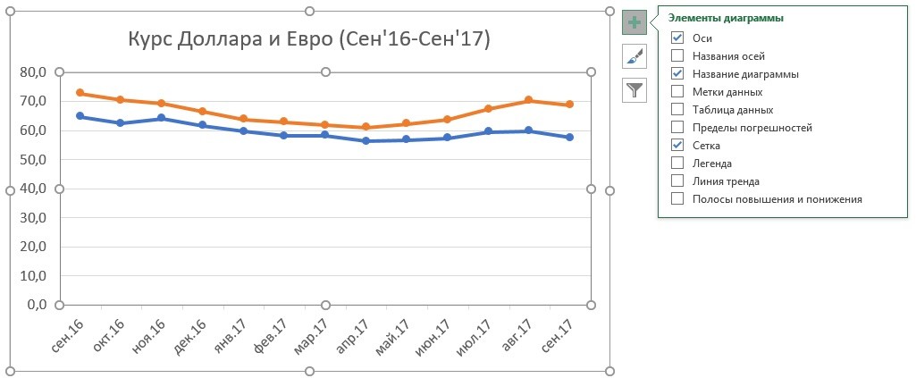
- In the pop-up window, check the box next to the “Chart name” item:
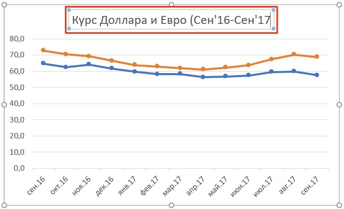
- A field with the name of the graph will appear above the graph. Click on it with the left mouse button and enter your name:
How to label axes in an Excel chart
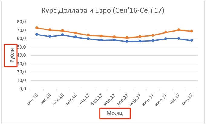
For better information content of our chart in Excel, it is possible to label the axes. For this:
- Click the left mouse button on the graph. A “green cross” will appear in the upper right corner of the chart, clicking on which will open the settings of the chart elements:
- Click the left mouse button on the “Axis Names” item. Headings will appear on the graph under each axis, in which you can enter your own text:
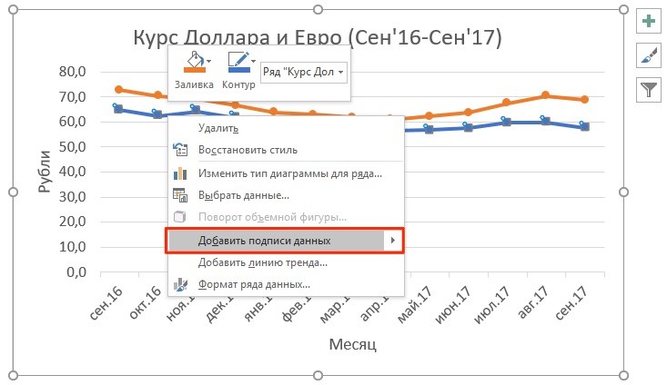
How to add data labels to an Excel chart
Your graph can become even more informative with the label of the displayed data.
On the example of exchange rates, we want to display on the chart the cost of the dollar and the euro on a monthly basis. For this we need:
- Right-click on the graph line to which you want to add data. Select “Add data labels” from the drop-down menu:
The system displayed the dollar rate on the graph line, but this did not improve the visibility of the data, since the values merge with the graph. To customize the display of the data label, you will need to take the following steps:
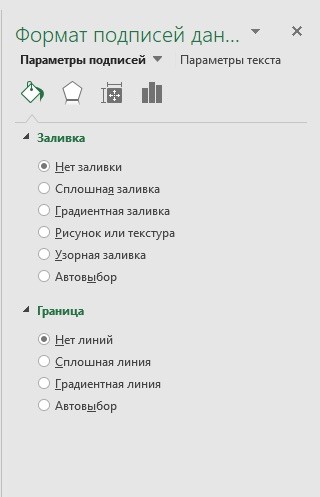
- Right-click on any value of the graph line. In the pop-up window, select “Data Label Format”:
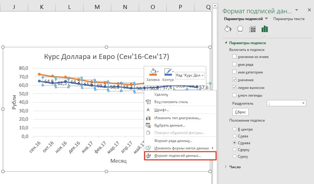
In this menu, you can set the position of the label, as well as what the data label will consist of: series name, category, value, etc.
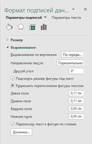
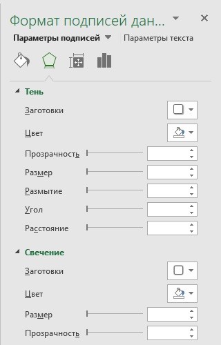
In addition to the location settings, in the same menu you can adjust the size of captions, effects, fill, etc.:
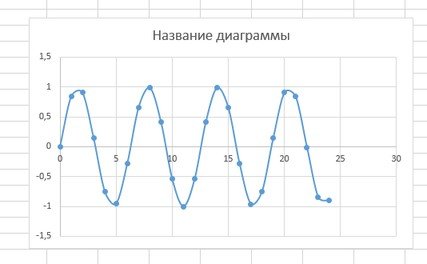
Having configured all the parameters, we got the following exchange rate chart:
Microsoft Excel- convenient, multi tool, pleasing a person by building various charts and graphs. Even if the user is not too well versed in this program, he still has enough strength to solve many issues.
Today we will look at how to build a graph in software. It turned out that there are two versions of the application. This is a 2003 and 2013 release. Both versions greatly simplify the process of plotting.
To create a schedule in the program, you must follow the procedure:
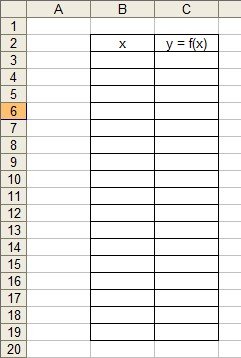
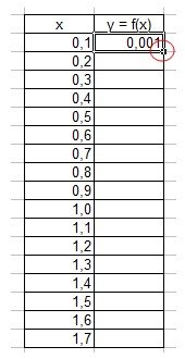
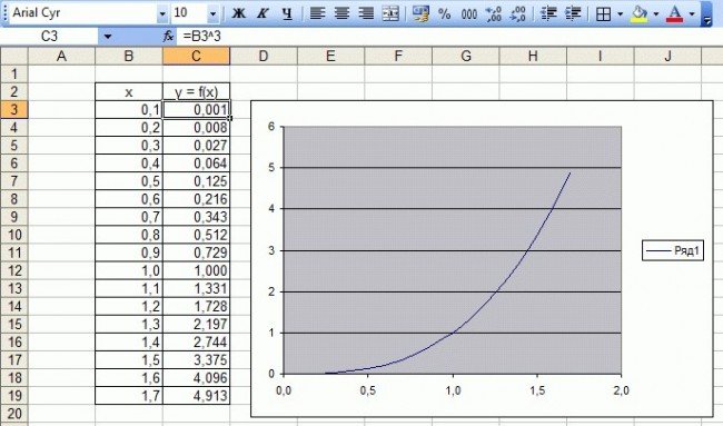
Before starting construction, you need to open a new document, create a blank sheet, and make two columns. In one you will write the arguments, and in the other the function itself will be placed. All this can be seen in the image.
The next step involves adding one argument to the column. Then the formula will be entered, we chose a fairly simple solution to demonstrate the solution.
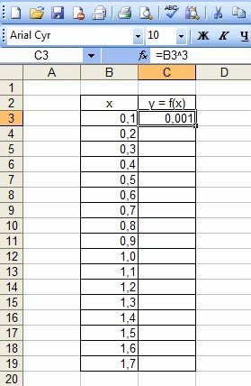
Before you write a formula, you must put an equal sign. After that, in each column you need to insert the resulting formula. For example, it will look like this: =B3*B3*B3, in order not to do everything manually, the developers took care to automate everything. Now it is enough to stretch this formula over the entire column so that everything fills up quickly, and the cells have the necessary values.
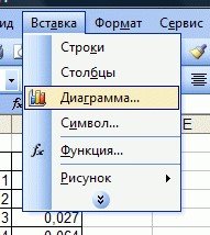
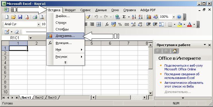
The next step is to create a graph. To make a graph, you must first go to the "Menu" tab, then select "Insert", and go to the "Chart" item. This is all shown in the figure below.
In addition, a person will need to select the cells that contain the values of the argument and function, then pressing the "Finish" button.
After this action, you will see a graph similar to the one shown in the photo.
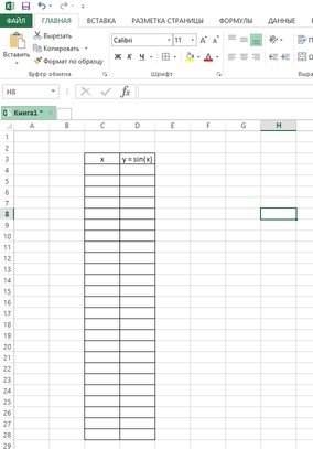
To figure out how to build a graph in the 2013 version, you need to take, for example, a function such as the sine function.
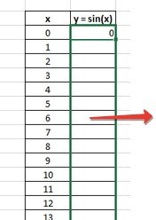
First, we create a blank sheet, enter the argument of the X function, and the Y function, before that we arrange everything in the form of a table, and arrange everything in two rows.
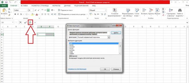
The next step involves the introduction of new values. Among other things, you will need to enter the formula, not forgetting that you need to start with an equal sign. For example, =SIN(C4).
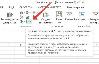
After the table has been filled in, you need to proceed to the direct creation of the graph itself. To do this, you need to highlight all the table values along with the headers.
After this stage, click on the "Insert" tab, and select there such an item as "Insert Scatter Plot".
Further after the choice has been made, a scatter plot will appear in front of your eyes. If you introduce any adjustments, this will significantly affect the chart itself. The changes made are necessary in order to change the project at will.
If some difficulties began to arise during the creation process, you need to determine whether you are using the correct formulas. It is enough to use a ready-made template to determine where you made a mistake.
Now you have information on how you can carry out actions aimed at obtaining a finished schedule. The whole process described here helps to achieve excellent performance.
To remove extra digits after the decimal point in the "Format Cells" dialog box, there is the "Number" tab ... more
How to visually divide a number into digits
In order to divide a number into digits for easier reading (compare: 10000 or 10,000) in the "Format Cells" dialog box… moreHow to round a value
We put the cursor next to the cell that we are going to round and go to "Functions". We find in mathematical functions rounding and set the number of digits after the decimal point ... nextHow to make a discount
We will make a given discount from the received price. I can offer 2 ways to choose from. furtherHow to calculate markup and margin
From the "To help the merchant" block, we know that: Margin = (Sale price - Cost price) / Cost price * 100Margin = (Sale Price - Cost) / Sell Price * 100
Getting Started with Formulas in Excel
How to mark up a number
We will make a 10% markup on the old price of our price list. The formula will be: ... nextHow to calculate the penalty
Consider two cases:- based on 0.1% per day of delay
- based on the refinancing rate on the day of calculation (we take 10%), further
How to prepare a price list
As a rule, a price list implies a listing of goods with an indication of their cost. Additionally, various indicators can be indicated: parameters, quantity per package, barcode, etc. moreHow to make changes to the finished price list
What problems can we face in the process? For example:1. The old price list is made in Word.
2. In connection with the change of names, many identical changes must be made.
3. We start formulas, but they are not considered.
Let's start in order...more
How to make an extra charge on the base price list so that the client does not notice it
We need to make a new increased price based on the existing price list, but also do it in such a way that the client does not guess that we have performed some actions on the base price list ... moreHow to Calculate the Break Even Point
So, we are faced with the task of compiling the presented table, which, when given certain parameters (revenue and costs), will calculate the break-even point. furtherHow to calculate the price with a given margin
Let's create a universal table that will give us the opportunity to calculate the price with several given parameters. furtherHow to create a database
As a rule, the database is a large table where all data about customers, products, etc. is entered. The presence of a database in Excel allows you to sort by certain parameters and quickly find any information. furtherHow to count the number of customers by sales channel in the database
With the help of an autofilter, we can count the number of our customers by sales channels, if it is required for any reports… moreHow to List Students Not Eligible for an Exam Based on Pass Data
Suppose you work in the dean's office of the institute and you urgently need to make a list of students admitted to the exams. On hand you have data on the delivery of offsets. furtherHow to isolate clients who owe more than legal costs
Many organizations operate today with deferred payment. Almost every one of them sooner or later faces payment delays. Often the case goes to court. At the same time, payment arrears can be both a significant amount and a meager one. Naturally, it makes no sense to sue a defaulter whose debt is less than the legal costs. furtherSearch and replace. How to bulk replace values
Suppose our manufacturer has radically changed the name of the product. If earlier all toys were called "dolls", now they have come under the new name "baby dolls". Are we really going to go into each cell and change all the values? Of course not!Please help, it's very important! z=(x^2)/2-(y^2)/2 x1=-10; x2=10 y1=-10; y2=10
Charts and Graphs
Introduction to charting
Building and editing charts and graphs
Set color and line style. Editing a chart
Format text, numbers, data, and fill selection
Change the chart type
Bar charts
Area charts
Pie and donut charts
3D graphics
Change the default charting format
Additional options when building a chart
Graphs of mathematical functions
Representation of data in graphical form allows you to solve a wide variety of tasks. The main advantage of such a representation is visibility. The trend is easily visible on the charts. You can even determine the rate of trend change. Various ratios, growth, the relationship of various processes - all this can be easily seen on the graphs.
In total, Microsoft Excel offers you several types of flat and three-dimensional charts, which, in turn, are divided into a number of formats. If these are not enough for you, you can create your own custom chart format.
Introduction to charting
The procedure for constructing graphs and charts in Excel is notable for both its wide possibilities and its extraordinary ease. Any data in the table can always be represented graphically. For this, it is used diagram wizard , which is called by clicking on the button with the same name, located on the standard toolbar. This button belongs to the button category Diagram .
Chart Wizard is a four-step diagramming procedure. At any step you can click the button Ready , resulting in the plotting of the diagram being completed. Buttons Next> and <Назад You can control the charting process.
In addition, to build a chart, you can use the command Insert / Diagram .
Having built a chart, you can add and remove data series, change many chart parameters using a special toolbar.
In the process of building a diagram, you have to determine the place where the diagram will be located, as well as its type. You must also determine where and what labels should appear on the diagram. As a result, you get a good workpiece for further work.
In other words, after pressing the button Ready You get a set of objects to format. For each element of the chart, you can call up your formatting menu or use the toolbar. To do this, just click on the chart element to select it, and then click right button mouse to open a menu with a list of formatting commands. As an alternative way to enter formatting mode for a chart element, you can double-click on it. As a result, you immediately find yourself in the object formatting dialog box.
Term "chart active" means that in the corners and in the middle of the sides of the chart field there are markers that look like small black squares. The chart becomes active if you press the mouse button anywhere in the chart (it is assumed that you are outside the chart, that is, the cursor is placed in a cell in the active sheet of the book). When the chart is active, you can resize the box and move it around the worksheet.
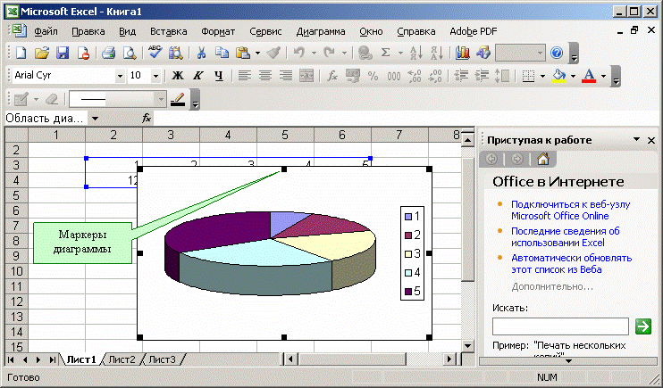
Working with elements or objects of the diagram is performed in the diagram editing mode. A sign of the diagram editing mode is the presence of a border border of the field and markers located at the corners and midpoints of the sides of the diagram field. Markers look like black squares and are located inside the chart area. Double-click on the chart to switch to edit mode.
You can use the arrow keys to navigate through the chart elements. When you move to an element, markers appear around it. If at this moment you press the right mouse button, a menu will appear with a list of commands for formatting the active element.
Building and editing charts and graphs
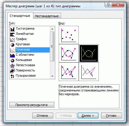
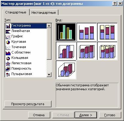
Let's get acquainted with the work of the diagram wizard. The first step in building a diagram involves choosing the type of future image. You have the option to choose a standard or non-standard chart type.
The second step is to select the data source for the chart. To do this, directly on the worksheet with the mouse, select the required range of cells.
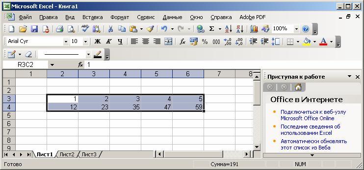
It is also possible to enter a range of cells directly from the keyboard.
If the chart includes several series, you can group data in two ways: in the rows of the table or in its columns.
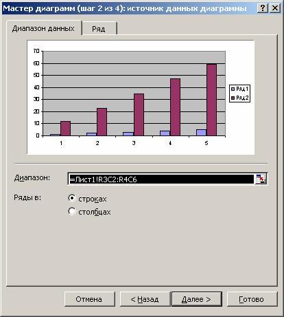
For this purpose on the page Data range there is a switch Rows in .
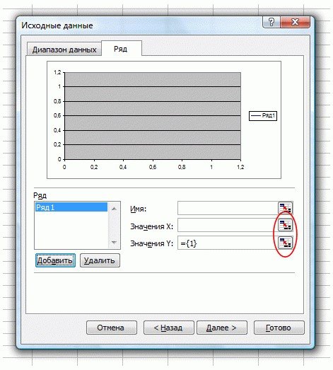
In the process of building a chart, it is possible to add or edit data series used as source data.
The second page of the dialog box in question is used to form data series.
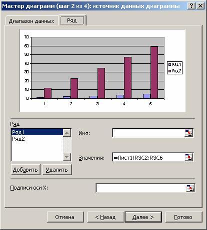
On this page, you can fine-tune the series by setting the name of each series and the units for the x-axis.
You can set the row name in the field Name , by typing it directly on the keyboard, or by selecting it on the sheet, temporarily minimizing the dialog box.
In field Values are the numerical data involved in the construction of the diagram. To enter this data, it is also most convenient to use the window minimization button and select the range directly on the worksheet.
In field X-axis labels the X-axis units are entered.
At the third step of construction, it is necessary to set such chart parameters as titles and various labels, axes, as well as the format of auxiliary chart elements (grid, legend, data table).
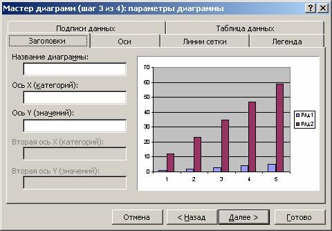
This is where you come across the concept of row and column labels, which are row and column headings and field names. You can include them in the area for which the chart will be built, or not. By default, the chart is built over the entire selected area, that is, it is considered that the rows and columns for the labels are not selected. However, when there is text in the top row and left column of the selection, Excel automatically generates labels based on them.
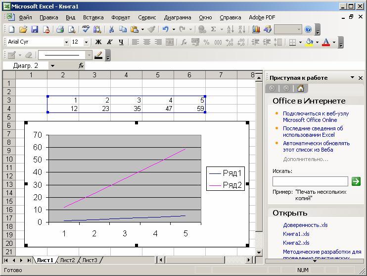
The fourth step of the Chart Wizard is to set the chart placement options. It can be located on a separate sheet or on an existing sheet.
![]()
Click the button Ready , and the build process will end.
Set color and line style. Editing a chart
The diagram is built, after which it needs to be edited. In particular, change the color and style of the lines that depict the series of numbers located in the rows of the source data table. To do this, you need to switch to the diagram editing mode. As you already know, for this you need to double-click the mouse button on the diagram. The frame of the chart will change, a border will appear. This indicates that you are in chart editing mode.
An alternative way to switch to this mode is to press the right mouse button while its pointer is on the diagram. Then in the list of commands that appears, select the formatting item for the current object.
You can resize the chart, move the text, edit any of its elements. The sign of the editing mode is the black squares inside the diagram. To exit the diagram editing mode, just click outside the diagram.
Moving diagram objects is done in diagram editing mode. Go into it. To move a chart object, do the following:
click on the object you want to move. In this case, a border of black squares appears around the object;
move the cursor to the border of the object and click the mouse button. A dashed box will appear;
move the object to the desired location (moving is done with the mouse cursor) while holding down the mouse button, then release the button. The object has moved. If the position of the object does not suit you, repeat the operation.
To change the size of the field on which any of the chart objects is located, perform the following actions:
click on the object you want to resize. In this case, a border of black squares appears around the object;
move the mouse pointer to the black square on the side of the object you are going to change, or to the corner of the object. In this case, the white arrow turns into a bidirectional black arrow;
click and hold the mouse button. A dashed box will appear;
move the border of the object to the desired location by holding down the mouse button and release the button. The size of the object has changed. If the size of the object does not suit you, repeat the operation.
Note that the dimensions and position of the chart change in the same way. To change the size and position of the chart, it is enough to make it active.
Format text, numbers, data, and fill selection
The formatting operation for any objects is performed according to the following scheme.
Click the right mouse button on the object you want to format. A list of commands appears, depending on the selected object.
Choose a command to format.
An alternative way to format an object is to call the appropriate dialog box from the toolbar.
This window appears when formatting the OX and OY axes.
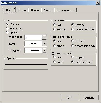
The formatting commands are determined by the type of the selected object. Here are the names of these commands:
Format chart title
Format legend
Format Axis
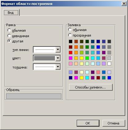
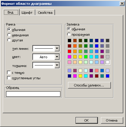
Format construction area
After choosing any of these commands, a dialog box for formatting the object appears, in which, using the standard Excel technique, you can select fonts, sizes, styles, formats, fill types and colors.
The charting area is a rectangle where the chart is directly displayed.
To change the filling of this area, right-click on it and select the option from the list that appears. Construction area format .
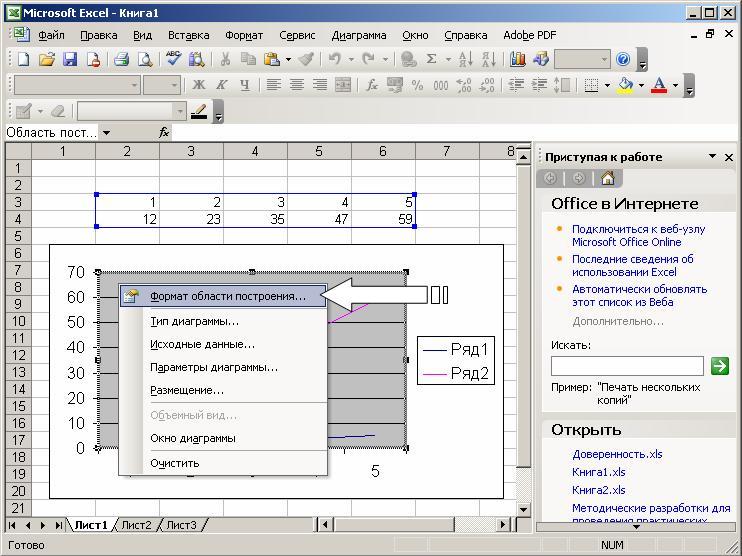
In the dialog box that opens, select the appropriate filling.
When working with Excel graphics, you can replace one data series with another in the constructed chart and, by changing the data on the chart, adjust the original data in the table accordingly.
In the dialog box Data series format tab View You can change the style, color, and thickness of the lines that represent the data series in the chart.
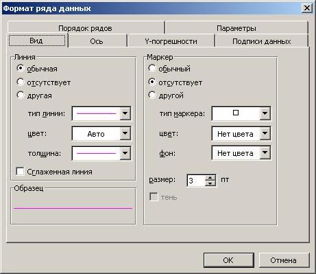
Tab Row order allows you to set the order in which series are arranged in the chart.
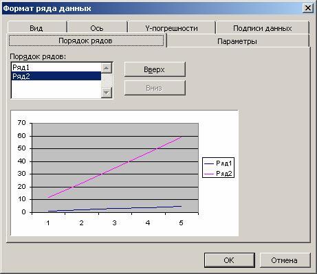
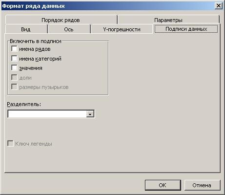
Using the tab Data Signatures you can define value labels for the selected series.
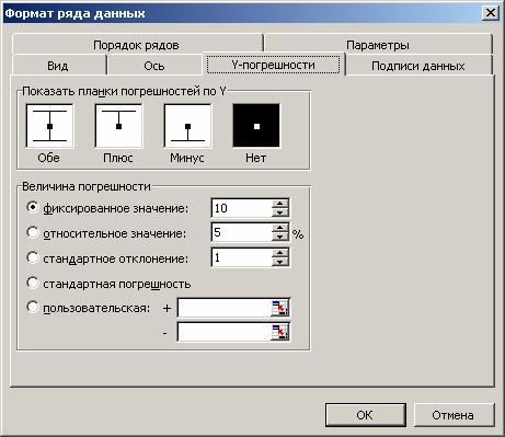
Tab Y-errors allows you to set the value error value, as well as display error bars along the Y axis.
In some cases, you may need to recover lost information. For example, in the object formatting menu, such a command is Clear .

When entering the mode, you may accidentally press the key Enter or the mouse button, causing the object to disappear. To restore information in edit mode, use the keyboard shortcut ctrl-z.
There are situations in which pressing ctrl-z does not restore the object. This happens in those cases when you managed to perform some more actions before you realized that you need to restore the changes. For example, you deleted one line of the graph, and then made an attempt to edit some text. pressing ctrl-z will no longer restore the deleted line. Follow the steps below to restore a deleted line.
Select the desired chart and click the button Chart Wizard . A dialog box will appear Diagram Wizard - step 1 of 4 .
In the dialog box, specify the area on which the chart will be built, and click the button Next > or Ready .
This way you will restore the line itself, but the style, color and thickness of the line will not be restored. Excel will make a standard assignment that will need to be edited to restore the old line format.
Change the chart type
In the process of constructing a chart, we were faced with the choice of the type of charts and graphs. You can also change the type of an existing chart.
To change the type of a chart after it has been drawn, follow these steps:
Switch to chart editing mode. To do this, double-click on it with the mouse button.
Click the right mouse button when the mouse pointer is over the chart. A menu with a list of commands will appear.
Choose a team Chart type . A window will appear with samples of the available chart types.
Select the appropriate chart type. To do this, click the mouse button on the corresponding sample, and then either press the key Enter, or double-click the mouse button.
An alternative way to change the chart type is to select the appropriate button from the toolbar.
As a result of these actions, you will receive a diagram of a different type.
To change the chart title in the chart editing mode, click on the title text and switch to the text editing mode. To display the word on the second line, just press the key Enter before entering this word. If as a result of pressing a key Enter You exit the text editing mode, then first enter the text, then move the pointer in front of the first letter of the new text and press the key Enter.
The line format of a chart does not change when you change its type. To frame the columns of charts, the format that was used to format the previously constructed chart is used.
Note that changing the type of chart does not imply changing the rules for working with chart elements. For example, if you need to correct the original table by changing the type of diagram, then your actions do not depend on the type of diagram. You still select the data series you want to change by clicking on the image of that series in the chart. At the same time, black squares appear in the corresponding areas. Again, press the mouse button on the desired square and start changing the data by moving the bidirectional black arrow up or down.
By going to the tab View when formatting the plot area, you can choose the most suitable view for this type of chart.
The methods of changing the chart type considered above do not change its other parameters.
In Excel, you can build three-dimensional and flat charts. There are the following types of flat charts: Bar, Histogram, Area, Graph, Pie, Donut, Petal, XY-spot and mixed . You can also build three-dimensional charts of the following types: Bar, Histogram, Area, Graph, Pie and Surface . Each chart type, both 2D and 3D, has subtypes. It is possible to create non-standard chart types.
The variety of chart types provides the ability to effectively display numerical information in a graphical form. Now let's take a closer look at the formats of embedded charts.
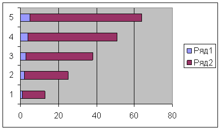
Bar charts
In charts of this type, the OX axis, or label axis, is located vertically, the OY axis is horizontal.
The bar chart has 6 subtypes, from which you can always choose the most suitable type for graphical display of your data.
For a convenient arrangement of numbers and serifs on the OX axis, you need to enter the axis formatting mode. To do this, double-click the mouse button on the OX axis. Do the same with the OY axis.
In conclusion, we note that everything said in this section also applies to the type of diagrams bar graph .
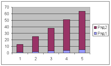
Histograms differ from bar charts only in the orientation of the axes: the OX axis is horizontal, and the OY axis is vertical.
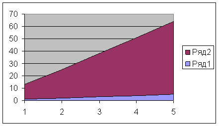
Area charts
A characteristic feature of area charts is that the areas bounded by the values in the data series are filled with hatching. The values of the next data series do not change in magnitude, but are plotted against the values of the previous series.
Pie and donut charts
Donut charts differ from pie charts in the same way that a ring differs from a circle - the presence of an empty space in the middle. The choice of the required type is determined by considerations of expediency, clarity, etc. From the point of view of construction technique, there are no differences.
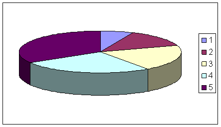
With a pie chart, you can only show one data series. Each element of the data series corresponds to a sector of the circle. The area of the sector as a percentage of the area of the entire circle is equal to the share of the row element in the sum of all elements.
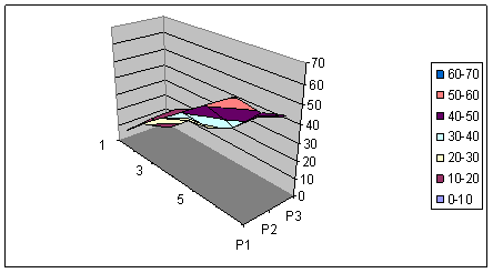
3D graphics
Spatial graphics have great potential for visual demonstration of data. In Excel, it is represented by six types of three-dimensional charts: Histogram, Bar, Area, Graphic, Pie and Surface .
To obtain a three-dimensional diagram, you need to select a spatial sample at the first step of constructing a diagram.
The 3D diagram can also be accessed in the diagram editing mode. To do this, check the box Volumetric in those modes where the chart type changes.
New objects appeared on the 3D chart. One of them is the bottom of the chart. Its editing mode is the same as for any other object. Double-click on the chart base, as a result of which you will switch to its formatting mode. Alternatively, press the right mouse button while the mouse pointer is over the chart base and select the command from the menu that appears. Base format .
When you press the right mouse button in the diagram editing mode in the list of commands, one more is added to the previously existing ones - 3D view . This is a very effective command for spatially orienting a chart.
When executing the command 3D view a dialog box appears 3D projection format , in which all spatial movements (rotation, elevation and perspective) are quantified. You can also perform these operations using the corresponding buttons.
You can also change the spatial orientation of the diagram without using the command 3D view . When you press the left mouse button at the end of any coordinate axis, black squares appear at the vertices of the box containing the diagram. As soon as you place the mouse pointer in one of these squares and press the mouse button, the diagram will disappear, and only the box in which it was located will remain. By holding down the mouse button, you can reposition the box by pulling, squeezing, and moving its edges. By releasing the mouse button, you get a new spatial arrangement of the diagram.
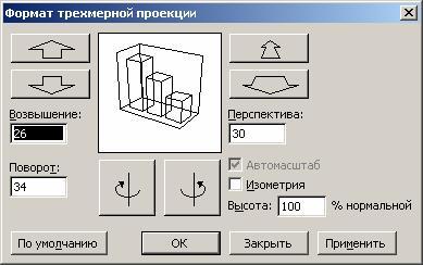
If you are confused when looking for a suitable chart orientation, click the button Default . It restores the default spatial orientation settings.
The trial window displays how your chart will be positioned with the current settings. If you are happy with the layout of the diagram in the trial window, click the button Apply .
Parameters Elevation and perspective in the dialog window 3D projection format change, as it were, the angle of view on the constructed diagram. To understand the effect of these parameters, change their values and look at what happens to the chart image.
Pie charts look very good on the screen, but, as in the flat case, only one data series is processed.
In Excel, you can build charts consisting of various types of graphs. In addition, you can plot a single data series or a generic group of series along another secondary value axis.
The range of applications of such diagrams is extensive. In some cases, you may need to display data on the same chart in different ways. For example, you can format two data series as a histogram and another data series as a graph, making the similarities and contrasts of the data more visible.
Change the default charting format
As you may have noticed, Chart Wizard formats chart elements always in a standard way for each chart type and subtype. And although a fairly large number of chart subtypes are built into Excel, there is often a need to have your own, custom chart format.
Let's look at a simple example. You need to print graphs, but there is no color printer. You have to change the style and color of the lines every time. This causes certain inconveniences, especially if there are many lines.
Let's consider another example. You have already decided on the type and format of the charts that you want to build. But if you immediately after determining the location of the diagram and the source data, press the button Ready in the 4-step charting process, Excel builds a bar chart by default and you have to go through the entire plotting process every time. Of course, using the appropriate custom format simplifies the process. However, some inconveniences still remain: first, you build a default histogram based on the given data, then enter its editing mode and apply the appropriate format there. This process is greatly simplified by changing the default chart format.
By default, when building a chart, the type is used bar graph . The term "default" means the following. After the data is specified when building a chart, you press the button Ready . In this case, the default chart appears on the screen.
To change the default charting format to the current chart variant, follow these steps:
Switch to edit mode for the chart you intend to set as the default chart.
Execute the command Service / Options and in the opened dialog box Parameters select tab Diagram .
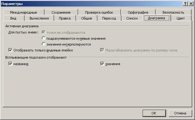
Install or remove the necessary switches. In accordance with these settings, all new diagrams will now be built.