To remove extra digits after the decimal point in the "Format Cells" dialog box, there is the "Number" tab ... more
How to visually divide a number into digits
In order to divide a number into digits for easier reading (compare: 10000 or 10,000) in the "Format Cells" dialog box… moreHow to round a value
We put the cursor next to the cell that we are going to round and go to "Functions". We find in mathematical functions rounding and set the number of digits after the decimal point ... nextHow to make a discount
We will make a given discount from the received price. I can offer 2 ways to choose from. furtherHow to calculate markup and margin
From the "To help the merchant" block, we know that: Margin = (Sale price - Cost price) / Cost price * 100Margin = (Sale Price - Cost) / Sell Price * 100
Getting Started with Formulas in Excel
How to mark up a number
We will make a 10% markup on the old price of our price list. The formula will be: ... nextHow to calculate the penalty
Consider two cases:- based on 0.1% per day of delay
- based on the refinancing rate on the day of calculation (we take 10%), further
How to prepare a price list
As a rule, a price list implies a listing of goods with an indication of their cost. Additionally, various indicators can be indicated: parameters, quantity per package, barcode, etc. moreHow to make changes to the finished price list
What problems can we face in the process? For example:1. The old price list is made in Word.
2. In connection with the change of names, many identical changes must be made.
3. We start formulas, but they are not considered.
Let's start in order...more
How to make an extra charge on the base price list so that the client does not notice it
We need to make a new increased price based on the existing price list, but also do it in such a way that the client does not guess that we have performed some actions on the base price list ... moreHow to Calculate the Break Even Point
So, we are faced with the task of compiling the presented table, which, when given certain parameters (revenue and costs), will calculate the break-even point. furtherHow to calculate the price with a given margin
Let's create a universal table that will give us the opportunity to calculate the price with several given parameters. furtherHow to create a database
As a rule, the database is a large table where all data about customers, products, etc. is entered. The presence of a database in Excel allows you to sort by certain parameters and quickly find any information. furtherHow to count the number of customers by sales channel in the database
With the help of an autofilter, we can count the number of our customers by sales channels, if it is required for any reports… moreHow to List Students Not Eligible for an Exam Based on Pass Data
Suppose you work in the dean's office of the institute and you urgently need to make a list of students admitted to the exams. On hand you have data on the delivery of offsets. furtherHow to isolate clients who owe more than legal costs
Many organizations operate today with deferred payment. Almost every one of them sooner or later faces payment delays. Often the case goes to court. At the same time, payment arrears can be both a significant amount and a meager one. Naturally, it makes no sense to sue a defaulter whose debt is less than the legal costs. furtherSearch and replace. How to bulk replace values
Suppose our manufacturer has radically changed the name of the product. If earlier all toys were called "dolls", now they have come under the new name "baby dolls". Are we really going to go into each cell and change all the values? Of course not!When working in Excel, tabular data is often not enough to visualize information. To increase the information content of your data, we recommend using graphs and charts in Excel. In this article, we will look at an example of how to build a graph in Excel based on table data.
Click "Insert" at the top of the screen. Select the desired type of graphic in the "Graphics" area, select the desired table in which you want to display the menu. The graph will appear in the spreadsheet. Click anywhere on the graph to select it. Click the "Design" tab at the top of the window, and then "Select Data" in the data area.
Click the Add button in the Input Icons section of the window. The window is minimized and replaced with the Edit Series window. Place the cursor in the Series Name text box in the Edit Series window. Click on the table that contains the second set of data you want to use in the field. If this page has multiple columns of data, you will need to add one by one, so click on one heading at the same time.
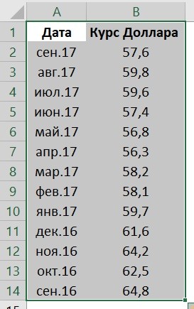
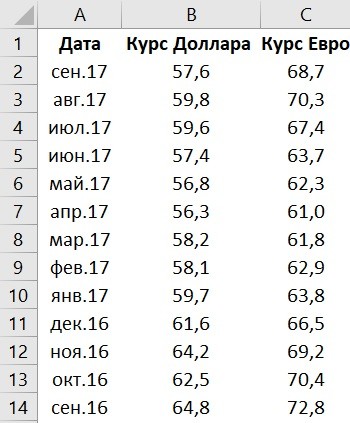
Let's imagine that we have a table with monthly data on the average dollar exchange rate during the year:
Based on this data, we need to draw a graph. For this we need:
- Select table data, including dates and exchange rates with the left mouse button:
Place the cursor in the "string values" text box. Click and hold the mouse button on the top cell of the data range. Then drag the mouse to the bottom cell and release the button. Click Add again to repeat the process and add another data series to another table, or click OK to close the data selection window and see the entire graph.
Building and editing charts and graphs
The bar chart we'll show you how to do in this tutorial should be used whenever we need to show comparisons. It's very common to see a bar or pie chart, but really, to demonstrate this type of comparison, the bar is what explains it best.
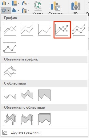
- On the toolbar, go to the “Insert” tab and in the “Charts” section select “Chart”:
- In the pop-up window, select the appropriate chart style. In our case, we select a graph with markers:
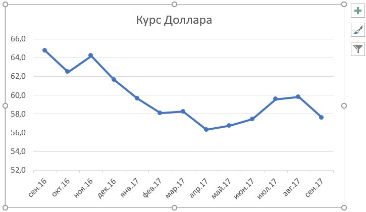
- The system built a graph for us:
He is trying to show how much we have people who are illiterate by the state. Note that these diagrams focus on format: use of colors, shapes, etc. but they are very difficult to read. In addition, a bar chart is for temporal analysis and a pie chart for identifying a fragment of a whole.
After all, what do we want to show? The goal is to show that states have more and more illiterate people. Therefore, the best chart is a bar as shown below. The histogram has the following characteristics. The width of the column must be greater than the width of the space between them. We don't put labels because we have a value axis. Don't use primary colors but for the panel you want to highlight. Imagine a table like the one below.
How to plot in Excel based on table data with two axes
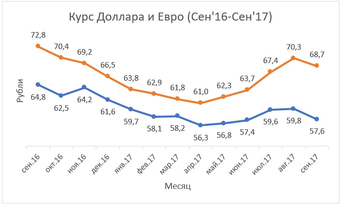
Imagine that we have data not only for the Dollar but also for the Euro, which we want to fit on one chart:
First, let's classify the values from highest to lowest. We will have something like the one below. Let's remove the title and set the message. Click right click mouse over the value axis and select Format Axis. In the Axis Options section, under Minimum, enter a value of zero.
Click Close, remove the gridlines, and format 2-axis fonts. The histogram is always sorted in descending order. If you notice even though we have placed our table in descending order, it will be reversed. To invert, click on the vertical axis and go to Format Axis.
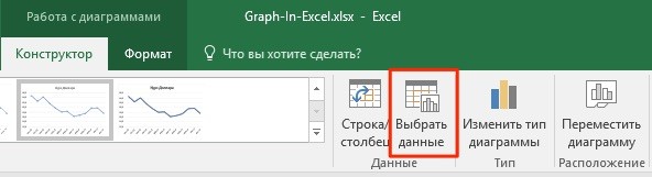
To add Euro exchange rate data to our chart, you need to do the following:
- Select the graph we created in Excel with the left mouse button and go to the “Designer” tab on the toolbar and click “Select Data”:
Check the categories in reverse order. When you do this, it will reset the value axis to the beginning. If you don't want, at the point of intersection of the horizontal axis, check the In the maximum category option. We will also remove the scale marks without selecting any in the main scale type.
How to add title to excel chart
Now let's format the bars. Right-click them and go to the Data Format section. Go to Sequences and Spacing Width, decrease the value to make the bar thicker. Now go to "Fill" and set the color. Adjust the color and border thickness if you like.
- Change the data range for the generated graph. You can change the values manually or select an area of cells by holding down the left mouse button:

What is and what is a line chart
A line chart graphically represents values distributed over a timeline. Therefore, it should be used when you need to show a trend over time. The main characteristics of the line chart. Left to Right: This means the oldest date on the left and the most recent date on the right.
- Axes values can start from zero or not.
- The graph line should be more obvious than the axis lines.
- A line chart is not pasta.
- Filling with colored lines will be broken.
- Many lines give no trend, no comparison, just mess up.
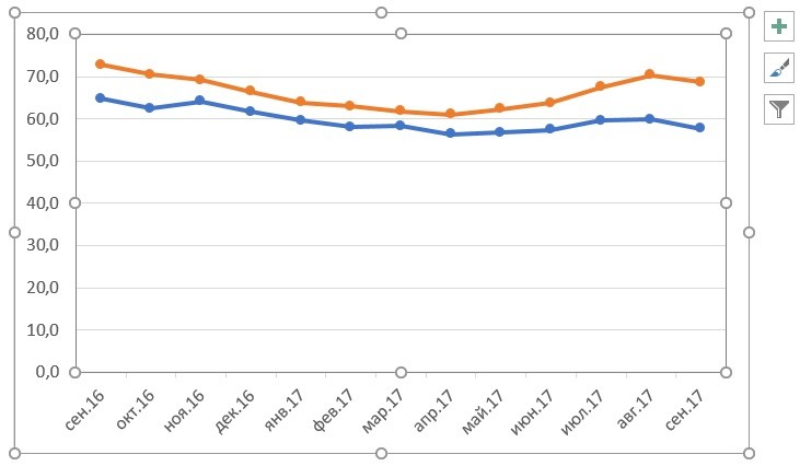
- Ready. The chart for the Euro and Dollar exchange rates is built:
If you want to display graph data in different formats along two axes X and Y, then for this you need:
At first glance, the most important thing is to click on the value axis to set it to zero. To format the value axis, right-click it and go to Format Axis. To format fonts, right click on the axis you want to format and go to the " Homepage". Choose font, color, size, alignment.
Then do the same with the other axis. Now let's format the data series. Click on the string, right click and go to the Data Format section. Format the line color, its width. And then do the same with markers. Finally, format the grid line to get thinner, lighter color.
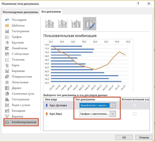
- Go to the "Designer" section on the toolbar and select "Change Chart Type":
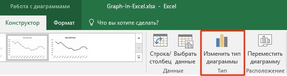
- Go to the “Combined” section and for each axis in the “Chart Type” section select the appropriate type of data display:
How to make an extra charge on the base price list so that the client does not notice it
Define a title for the chart, format it, and finish. Function software, which not everyone knows, but which can be very useful for work and for everyday work, is the creation of graphs. When it comes to organizing household expenses, this tool can help a lot to keep track of your own money and prevent you from reaching the end of the month in red. Here we will calculate monthly household spending rates to demonstrate this process.
- Press "OK"
Below we will consider how to improve the information content of the obtained graphs.
How to add title to excel chart
Step 2: select a table
If you prefer, you can organize your spreadsheet with daily or weekly expenses. Once your spreadsheet is complete, select the information you want to retrieve and click Insert. In this case, we chose the variable costs of the month.
Step 3 - Choose a Chart Type
Now choose the type of chart you want to make. To see the percentage of a particular type of monthly expense compared to others, pie chart perfect; to compare the expenses of one month in relation to another, the most indicated is one of the lines; to compare how different expenses change each month, a good choice is the column selection.
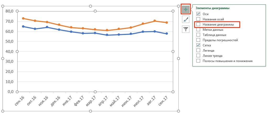
In the examples above, we built graphs of the Dollar and Euro rates, without a heading it is difficult to understand what it is about and what it refers to. To solve this problem we need:
- Click on the chart with the left mouse button;
- Click on the “green cross” in the upper right corner of the chart;
- In the pop-up window, check the box next to the “Chart name” item:
In this example, we chose a bar chart to compare the amounts spent on variable expenses between April and May and June. To view information about this, place the mouse pointer over the image. You can edit the colors and model of the chart by choosing the "Design" option, as well as the size of the spacing between columns, right-clicking on the index column, and then clicking "Format Axis".
Step 2 - Create a Scatter Plot
First we have to create our data table. Insert your details as shown below. The years of the last 10 FIFA World Cups are inserted into the column.
Step 3 - Format the Horizontal Axis
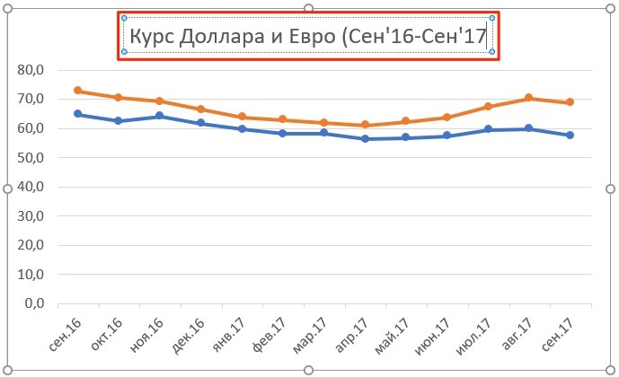
After creating the chart, the date is probably started in order to change these years, we will start formatting the horizontal date axis.- A field with the name of the graph will appear above the graph. Click on it with the left mouse button and enter your name:
How to label axes in an Excel chart
For better information content of our chart in Excel, it is possible to label the axes. For this:
Step 4 — Inserting and Formatting the Error Bar
So our chart starts in a year. Now we want the dates to appear every 4 years. Now let's insert a vertical error bar. Now let's format the error bar. Right click on the error bar and select "Format Error Bar" and configure as shown below.
Step 5 — Inserting and Formatting the Data Label
The graphic should look like this. Now let's insert a legend on the chart. Please note that labels have item descriptions. Here's a big trick. To display country names in labels, right-click the label and select Format Data Label.
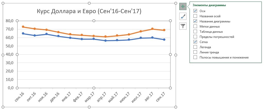
- Click the left mouse button on the chart. A “green cross” will appear in the upper right corner of the chart, clicking on which will open the settings of the chart elements:
Step 6 - Completing the Chart
Your chart should look like this. Now let's format the graph to hide the vertical and horizontal lines and give the graph a name. To rename the name of the chart, click on the name of the chart and enter the desired name, in this case let's name the name "Champions of the past world".
I hope you enjoyed the article and any questions leave in the comments below. The link only connects the document and the object so that its presentation is not overloaded, but be careful if you move the presentation or if you want to send it via e-mail eg don't forget related files! inclusion: the object is an integral part of your presentation, no more worries about moving files! Link: The object is not inserted into the document. . This will be done, we will immediately forget the link that does not work with today's topic.
- Click the left mouse button on the “Axis Names” item. Headings will appear on the graph under each axis, in which you can enter your own text:
The graph may be on the same page as the data, it doesn't matter. This method, although applicable to other types of charts, is especially interesting for bar charts and horizontal bars.
- Go to the "Image" tab and click the "Select Image" button.
- Select the desired image and click the "Insert" button.
- Select a graphic and copy it.
Search and replace. How to bulk replace values
You will be able to display this graph progressively during the slideshow by category or by series, grouped or not. In the Custom Animation task pane, select an effect from the Add Effect drop-down list. Select the animation you just applied to the graph, click the drop-down arrow, and click the Effect Options button. On the Effect tab, select a direction, and finally click on the Animation tab of the graph: In the Group Graph drop-down list, select the most appropriate option to animate your graph: By Series By Category, By Series Elements, or By Category Elements. We advise you to check the Animate Mesh option and the legend which will make your animation heavier.
- Choose a graphic.
- From the Slideshow menu, choose Customize Animation.
- All you have to do is test your animation!
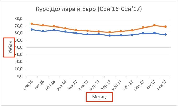
How to add data labels to an Excel chart
Your graph can become even more informative with the label of the displayed data.
On the example of exchange rates, we want to display on the chart the cost of the dollar and the euro on a monthly basis. For this we need:
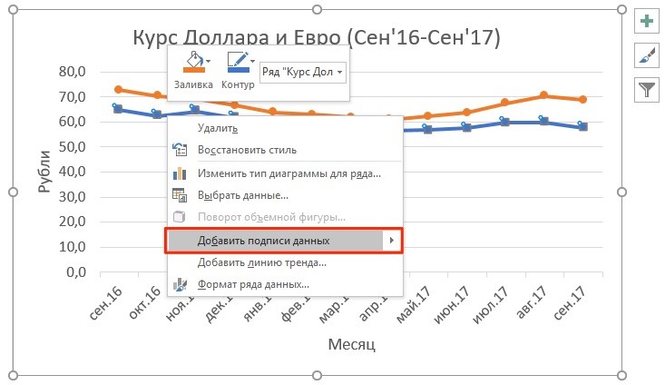
- Right-click on the graph line to which you want to add data. Select “Add data labels” from the drop-down menu:
The system displayed the dollar rate on the graph line, but this did not improve the visibility of the data, since the values merge with the graph. To customize the display of the data label, you will need to take the following steps:
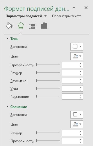
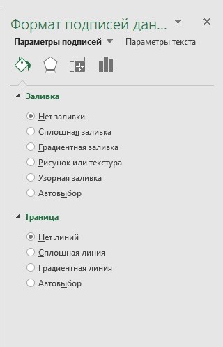
- Right-click on any value of the graph line. In the pop-up window, select “Data Label Format”:
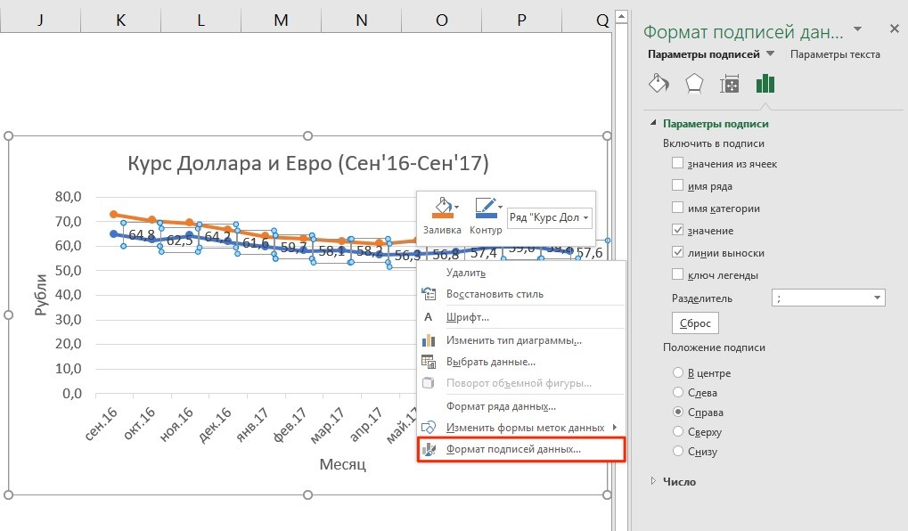
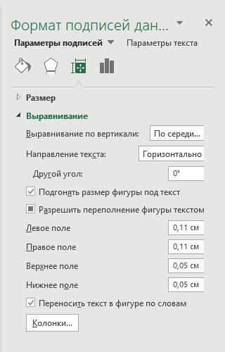
In this menu, you can set the position of the label, as well as what the data label will consist of: series name, category, value, etc.
In addition to the location settings, in the same menu you can adjust the size of captions, effects, fill, etc.:
Having configured all the parameters, we got the following exchange rate chart: